Magnetite - Update #1
I don't know how the fuck this update is taking so long??
Hello everyone! Looks like you are having a good week, right? Well, I’m happy to share the current progress while I work some parts from the client. At least the update that I’m working on were becoming bigger since I’ve been working on UI parts and functionalities.
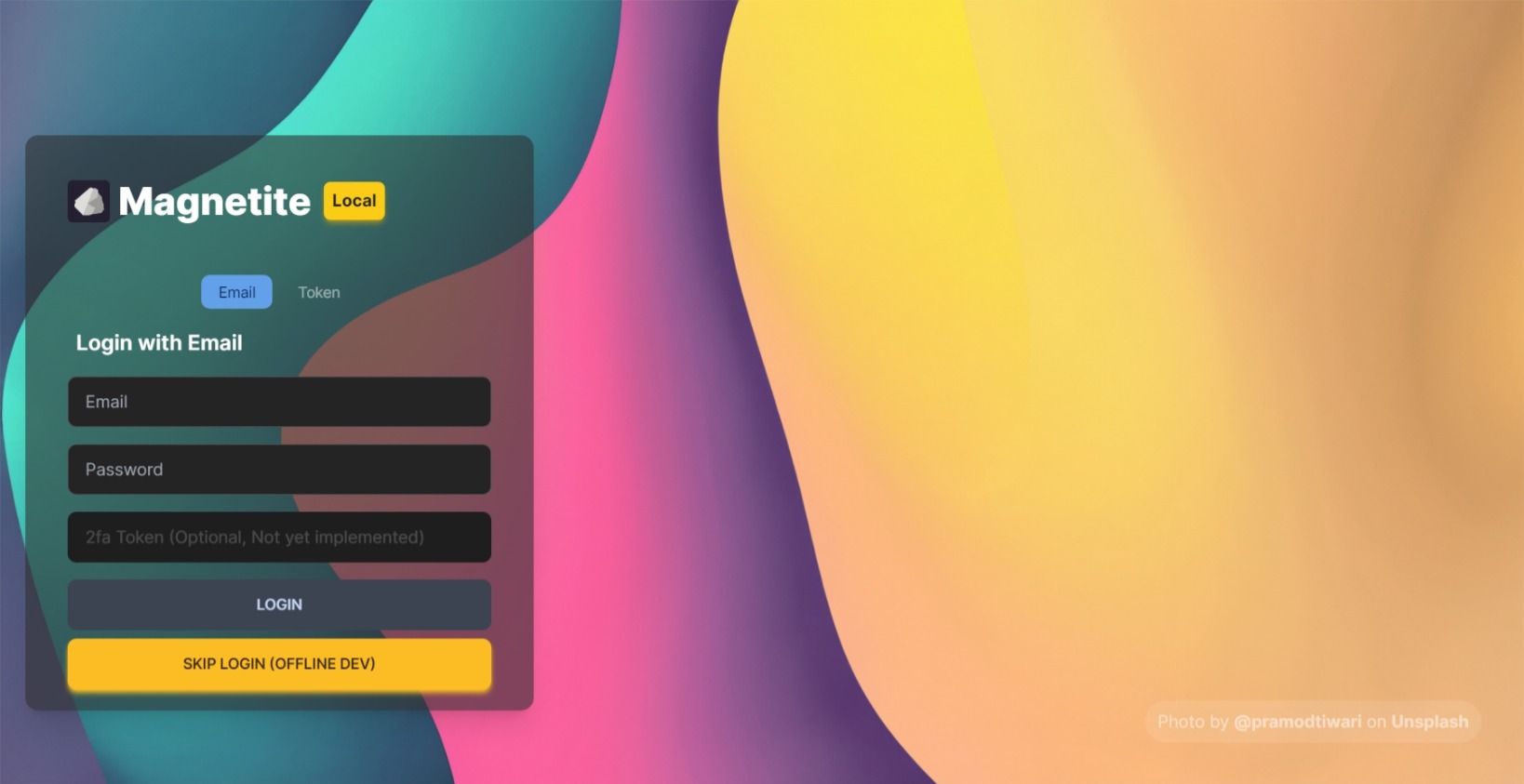
Updated Login (Sort of…)

If you noticed that there’s something wrong here (such as missing blur), it’s because Edge doesn’t have blur support on web screenshot sadly
I updated the login to match better from my own design system (since I focus most of UI and accessibility). The tabs were improved to better indicate where you are going for. Also, I added a dev/contributor only button for developing while the Wi-Fi is having issue, or you don’t have internet (for example you were in another place), but using this thing may or may not break the client.
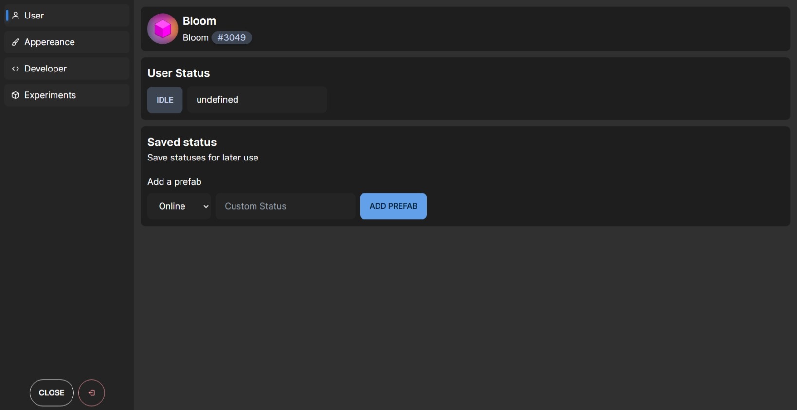
Settings Redesign

The sidebar navigation is similar to WinUI. But the indicator doesn’t animate it, only moves instead
Settings in Solenoid/Magnetoid were… uhhhh horrible, because you had to scroll for a specific configuration, so I was trying to fix and replicate it just like WinUI 2.x/3.x did. I separated everything to a separate category, so you can find it much easier. But… here’s something has changed, such as the User tab.
New bubble chat
There’s no screenshot for it yet. But you can check it out (not yet, XD)
I did update the message too, but. Doing that way was a bit painful, you had to even separate into classList instead of class, so it can use the corresponding color (the accent one) and the correct background color, and yeah, it’s separated between two side, one from people and one to you (this side will be accented to avoid confusion).
Miscellaneous and more…
During this complete redesign, I’ve fixed some parts (outside from UI), although, here’s some bit long list of changes during this time:
- Fixed many accessibility issues
- Replaced from Contributions into Notice (since it’s a fork so ¯\_(ツ)_/¯)
- Removed many useless imports to all components
- Fixed when the text overflows on
<UserBase/>(I hope it won’t happen yet again) - Fixed the hyperlink isn’t being accented
- Fixed indicator not being accented in Server Navigation
- Updated the system message and blocked message (now follows the current design system)
- Updated types (I hope TypeScript won’t get mad at me)
- Changed some UI colors to match the current design system
What’s next?
This update changed the client entirely (not too much), it took exactly 2 months (maybe if it’s right?) to make the client better and usable as I promised it since the start of this fork. But, I still need to add new features. But I’d plan to add some AI features.
In the future, I may add donations feature, so you can donate me when needed. Anyways, have a nice day!